When you get a spontaneous call from the president of Nintendo of America, you don’t ask too many questions. You just take the call.
That’s the advice that was given to designer Chris Maple by a fellow designer friend back in 1998, who warned him the call would be coming later that day. At the time, Maple was no stranger to sudden phone calls from company executives. Maple ran his own design business, Media Design, which specialized in last-minute work for companies in emergency, time-crunch situations whose agencies weren’t equipped to handle the speed or size of their request. Though it was rarely, if ever, publicly credited for this type of work, over Media Design’s history, Maple says his company quietly developed a good reputation with clients throughout its local Seattle area. He recalls doing work for (among many others) Boeing, the Seattle Mariners, Warehouse, Holland America Line cruises, and others.
Maple had been in the business for several years when then-Nintendo of America president Minoru Arakawa’s secretary phoned him and asked him to come visit the office in Redmond. He was told over the phone that the company wanted him to work on a new game, but that was it. Maple, intrigued, accepted the invitation, not knowing he was about to become an instrumental part of one of the biggest cultural phenomenons in the world: Pokémon.
Go West, Pocket Monsters
“So I showed up there and I sat in their lobby for about a half hour and stared at this beautiful 21-inch crystal horse in their lobby, a crystal horse head,” Maple recalls of the day he went to Nintendo of America’s Redmond HQ. “And I was like, just staring. You get a sensation. Like I’d have to read a room when I go into these corporate arenas, since I’m the subjective person presenting the aspect of imagery and content behind whatever’s bothering them that day or what’s broken or what needs to be fixed. You just learn to pick up stuff. So I was sitting there staring at this crystal head, and it was the Nintendo lobby.”
Eventually, Maple was taken upstairs into a meeting room where a few individuals were sitting, waiting for something. “It looked like the inquisitor was going to come out,” Maple recalls. But when Arakawa entered, Maple says he “was a very magnetic personality. I could tell why he was in the seat.”
I’ll let Maple relate what he remembers happening next:
“He introduced himself and said that they’re going to be launching a game officially in the United States and Europe. Only problem is, the prior agencies they’ve tried out for the situation didn’t quite hit the mark, and they burnt the budget and time element. Are you okay with that? And I go, ‘Yeah, sure. It’s going to cost a penny.’
“So this other person, she comes down and she has a little cardboard box, and she dumps all these toys and pieces of paper and weird drawings and things all in front of me on the table, and I’m looking at them, and she’s standing there with a smirk on her face holding the box, and I’m looking at Mr. Arakawa, and he’s just staring straight at me and I go, ‘What is this?’ And he goes, ‘It’s a Pocket Monster.’ And I said, ‘Oh, what’s a Pocket Monster?’ He goes, ‘It’s Pokémon. We’re going to call it Pokémon.’”
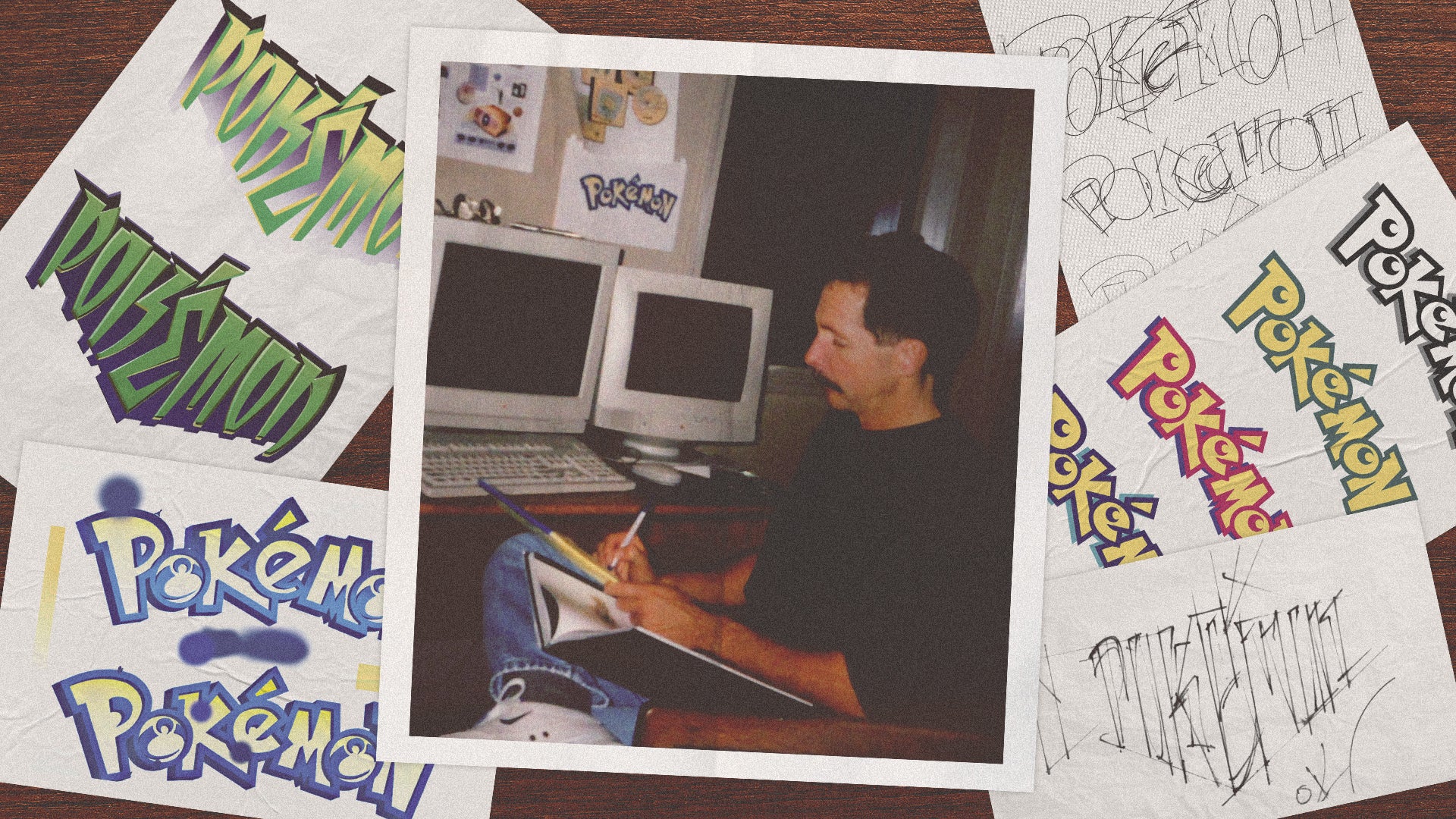
Maple was being asked to make a new logo for Pokémon, which at the time existed only in Japan as Pocket Monsters Red and Pocket Monsters Green. Nintendo wanted to release the game in the West with a Blue version and, later, a Yellow Pikachu Edition. But the company wanted a new logo to fit the rebrand from “Pocket Monsters” to “Pokémon”, and was struggling to find someone to nail the look. Maple wasn’t given any instruction on what Nintendo was looking for though, he says. Just one parameter: he had just one month to make it.
Attaching Energy
Normally, Maple tells me, a logo like this would take something like six months, with lots of back and forth between the designer and client, drafts and redrafts. Nintendo’s one month deadline wasn’t arbitrary, though. The new logo had to be ready for the big unveiling of Pokémon Red and Blue that would take place at E3 1998.
But Maple was used to cramming things like this into short spans of time. So he got to work. He drew numerous variations of a Pokémon logo by hand, on a light table, trying different letter shapes until he was happy with something. When he liked a logo, he’d set it aside, and try again to make something different, ultimately creating several variations to present to Nintendo so they could pick which they liked best.
Still, there wasn’t much to go on. Maple wasn’t given copies of the games to play, or even a lot of information on what Pokémon was. “We were given nothing but paper and toys,” he says, recalling that one of the toys was a very tiny Pikachu figurine. Nintendo did explain the game a little bit, he says, and he saw some illustrations of both existing and in-progress monsters as well as an early version of a Nintendo Power magazine that discussed the game (the final version of which would be the logo’s actual public debut). Maple was also instructed that the logo would need to be suitable for use on a tiny, pixelated GameBoy screen, and would have to work in both color and black and white.
After coming up with several variations, Maple took his suggestions back to Nintendo to present them. He tells me he opened by presenting a few versions he wasn’t as excited about, and says his audience was relatively unresponsive. But then, he showed his favorite.
The room was quiet, Maple says. He stayed quiet too. Then, again from Maple’s own recollection:
“And then Don James [former Nintendo of America executive VP of operations] speaks up and says, ‘I believe this is the one.’ And he starts shaking his head. He goes, ‘Yep, that’s the one. It’s the one.’ And everyone, Arakawa’s just sitting there. He goes, ‘Mm-hmm. Mm-hmm. Okay.’ And Lance [Barr, former Nintendo of America designer] gets up and leaves and Gail [Tilden, former Nintendo of America VP brand management] leaves and then Don looks at me and goes, ‘Produce it.’ I went, ‘Okay.’ So I went back and produced it.”
And so the Pokémon logo was born. I asked Maple why he liked the final version best, and why he thinks Nintendo accepted it. He tells me he can’t fully explain it. It’s vibes, he says.
“Energy in it. Also, when I was trying to take some of the real rough sketches from the original artists that did it for the person who started the game, I was trying to envision the story. There’s a story in everything, the story, brand story, what it possibly could turn into.”
Maple has a similar explanation for why the logo ended up yellow and blue. He tried a bunch of different color schemes. Maple admits it’s possible he was subconsciously thinking about the color-themed naming of the two new games being released in the West: Blue and Yellow. While Pokémon originally released in Japan in Red and Green versions, only Red was brought to global release alongside a slightly different, Blue version. Yellow, focused on Pikachu, came the following year. Maple was told about both Blue and Yellow in his work on the logo. But whether that was part of it or not, he says that the final version just seemed right to him. “It just feels a certain way,” he says. “I know it sounds flaky, but it’s true.”
Once the logo was finalized, Maple was largely removed from the rest of the process as Nintendo got to work marketing and eventually releasing the games. He says he didn’t think too much of it until one day, a few months later, he took his son to Toys R Us.
“We walk in the front door and there’s a massive display, big arches and everything, and TVs going and noise and the Pokémon logo, and I’m like, ‘Holy smokes. This is crazy.’”
Pokémon Forever
This wasn’t Maple’s final interaction with Nintendo, though, or even with the Pokémon logo. After E3, Maple recalls Arakawa asked him to alter the logo slightly. He doesn’t remember receiving any specific instructions on what exactly Arakawa wanted altered, though he says that clients telling him to “just change it a little” without extra instruction is fairly common in his field. So Maple went back to the drawing board, literally, and made some minor adjustments to the interior of the “P” and the “E”, resulting in the version of the logo we now know today.
Later, Maple was called back to do some other design work, and remembers assisting with design projects for games like Major League Baseball Featuring Ken Griffey Jr., Mischief Makers, and a Star Wars game he doesn’t recall the name of (possibly the Nintendo 64 release of Star Wars: Rogue Squadron). He also was called upon to redesign the Nintendo 64 box for the console’s Atomic Purple release.
He did eventually play the Pokémon games, just a little bit, but didn’t get too far. Maple was a busy man. He does remember his son collecting the trading cards when they came out…until they were banned at school.
“I’d be at a store or something and I’m buying something for my daughter and she’d be jumping up and down. She’d go, ‘My daddy did that logo,’ and a couple of moms would look at me in line and go, ‘Oh, so it was you, was it? You’re the guy.’”
Maple’s work with Nintendo eventually ran its course, as the company began hiring more and more in-house artists and designers. That was fine with him, though. He had plenty of other work lined up.
For years, Maple never spoke of his work on the Pokémon logo publicly. It wasn’t listed on his website, nor was he credited anywhere as the designer. He says that at the time, he wasn’t allowed to talk about it, and it’s fairly normal in his industry not to credit individual logo designers. But now, Maple’s started talking about it. He’s put the logo up on his website, alongside some newly-designed T-shirt mock-ups and other images, to showcase the massive project he took on all those years ago.
Why now?, I asked. Maple says a lot of it stemmed from conversations with his son, who urged him to come forward about his role and take credit where it was due.
“It’s just after years, it didn’t matter…So 27 years later, I thought I’m going to be changing what I do more and more, and I thought, why don’t I just, if I’m going to put this as one of my accreditations, I should have some kind of validation to it and move on. For all the people that are interested in the games, you, IGN, wouldn’t you want to know what really happened?”
I ask Maple if there’s anything he would do differently if he had the opportunity to do the logo now. He says he’d probably revert it back to the original logo that was accepted in 1998, before Arakawa had him adjust it slightly.
“The other thing I would probably do, I would feel kind of almost responsible about and maybe a little bit strong about, is when Pokémon turns 30 next year, they’ll probably try to do some celebration around that and whatever, and I know how things go, but they’re going to dig an artist out of the woodwork and he’s going to put 30th across that logo somewhere and it’s not going to be right.
“I know it won’t be right because all the base, all the foundational thought that went into creating it in the first place to survive the way it did and for us to be talking to one another today, there is an energy and a skeleton in there, and to even add another component, like the word 30th or two numerical characters, TLC [tender loving care], big time. Don’t just get it done. It’s going to be TLC. So I would hope that Pokémon International would ring me and say, ‘Hey, this would be great PR. The guy that did the logo gets to put the 30th on for us. Good PR for us.’ That would be smart of them to do. Of course I’m pitching for myself here.”
Though Maple’s work with Pokémon only spanned a few months, and only one image, that effort has since been replicated across everything Pokémon. Aside from perhaps Pikachu, the Pokémon logo is the most well-known and iconic symbol of the global phenomenon that’s only grown in popularity in the years since Maple unwittingly stumbled into the process of its creation.
So then, does he feel he had a hand in Pokémon’s ultimate success?
“I would say that in some way I feel responsible about all the children and the other people that have grown up that take ownership of this,” he says. “I feel really… I feel good about, that I did the thing responsibly for them. I teach children in challenged areas…And when I teach the children, they just go nuts. Once the teacher leaks the fact that I did this, I can’t get a word in edgewise because they’re saying, ‘Draw the characters for us, please.’ So I put it at the end of the lesson and I’ll do a couple characters and I’ll put the giant logo across the big white board in the classroom, and that became pretty popular.
“Some of the experiences you get are just priceless. But I’m just happy that it’s doing well…Yeah, I love it, and that’s why I work still today.”
Rebekah Valentine is a senior reporter for IGN. You can find her posting on BlueSky @duckvalentine.bsky.social. Got a story tip? Send it to rvalentine@ign.com.


